Decrease the total page width!!!
-
Do not keep it at 100%… it’s incredibly not reading friendly.
Keep at like 800px width max… or something width minus 200 px and leave 100px padding left and right on a laptop.
-
I agree. It needed to be wider, but now it’s too wide. I need larger left and right margins. I’m sure @dangeRuss made the width so wide in response to members’ request, but maybe he can scale it back a bit (I don’t speak “px”).
ETA: it looks fine on mobile, horrible on PC.
-
Mobile is fine… but most wont be on PW on phoneat work
")
-
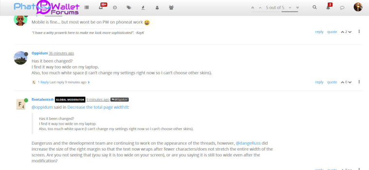
Has it been changed?
I find it way too wide on my laptop.
Also, too much white space (I can’t change my settings right now so I can’t choose other skins).
-
@oppidum said in Decrease the total page width!!!:
Has it been changed?
I find it way too wide on my laptop.
Also, too much white space (I can’t change my settings right now so I can’t choose other skins).Dangeruss and the development team are continuing to work on the appearance of the threads, however, @dangeRuss did increase the size of the right margin so that the text now wraps after fewer characters/does not stretch the entire width of the screen. Are you not seeing that (you say it is too wide on your screen), or are you saying it is still too wide even after the modification?
-
@fivetalents This is what I see
-
@oppidum said in Decrease the total page width!!!:
@fivetalents This is what I see
Thank you @Oppidum. That is how it should look after the recent modification. What part of it is still too wide for you, and what is that you would like to see instead?
-
the reply, quote, up and down arrow, 3 dots, they are all miles away from the right edge of the comments. for me, it would be more comfortable if they were more to the left, more below the comment.
there is too much white and it kind of gives me a headache to see so much of it and try to concentrate on the text.
the text is kind of grey as well, not as dark and sharp as it could be.
It is visually unpleasant for me to read the site for more than 10 minutes. just my opinion.maybe this is because i’m stuck with the default skin.
but I still think the page is way too wide.I even think the comment text is a bit too wide, I’d decrease it. For example, in the image I posted, in your fivetalents post, I would make the right margin after the comma of “appearance of the threads,” putting “however, dangeru… did” on the next line down.
-
@oppidum I think having whitespaces is not a bad thing, maybe we just need to increase the font a bit more or even out the whitespaces left and right. The upvote/downvote probably looks better on the left but it isn’t too bad on the right either. It’s an optional menu people can leverage. When I read the discussions, my eyes naturally read the text and only move all the way to the right when I want to upvote a post.
I’m not a UI/UX person so I’m not 100% sure what’s best and not. I’m currently testing moving the menu to the left. It needs more testing but hopefully you’ll see the changes soon 🙂
-
I have been lurking a bit since near the beginning, and finally signed up specifically to post thanks for setting the site to make some use the full browser window. It’s very unfashionable, but everyone else is wrong. We need more of this - why is the text of posts forced to wrap? It uses well under half my browser window width.
If you don’t like the width, can’t you just size your browser window to whatever width you like? With sites that artificially pad the sides with whitespace, there’s no simple or consistent way for someone with a wide monitor to force the content on a page to use the available space. Windows even has easy keyboard shortcuts for popping windows to half screen widths.
-
The posts in this thread go nearly the full width of my screen right now (desktop monitor), with about an inch of whitespace on either side. I find it very hard to read as this leaves the width of the actual text at about 17 inches, which is much more than most sites have in one line. I’d much prefer smaller width like other sites. Thank you.
-
Ha, I see what you report now too, hbg1. But like I said, you can make your browser window as narrow as you like, can’t you? What’s the point of maximizing your browser window if you prefer it mostly empty?
Thanks for the change, site gods. My physical display is even wider than hbg1’s, probably 20 inches excluding the paper-like margins. I hope this can remain at least as an option, but I understand we’re fighting against the current - the vast majority of sites and users seem to think layout should follow the limits of a portrait-mode phone.
-
SlimTim, you are right. I realized after I posted that I usually do have the browser window set at less than the maximum, but happened to have maximized it for a specific purpose yesterday and forgot to un-maximize the window afterwards. That’s why it looked different to me than I would have expected. I’m fine with the width the way it is. (But I’d still like the giant images at the top of the emails reduced, as described in another thread.)
-
My monitor is about 19 inches horizontially and earlier in the thread when I said that the comment text extended too widely across the screen, the comment text as it was presented on my moniotr was 11 inches wide then, but now I see tonight that it’s 16.5 inches wide (which is worse).
It is not pleasant to have to swivel the eyes back and forth on a stark white background, when this should be an easygoing, friendly, relaxing, interesting website to visit.
I understand that one poster above likes the vast expanse of text, and says that those who don’t like it can just make their browser windows smaller, but when I make my browser window smaller: one, it leaves off some of the graphics and links and functions (for example, most of those little icons across the top of phatwallet’s template are not shown to me when my browser window is reduced). two, why should I have to operate the internet uncomfortably like I’m reading it on a phone screen when I bought a 21 inch monitor for the very purpose of being able to see my computer display well and comfortably.
It is not as if having an extremely-wide comment text section is a standard default in internet discussion forums, at least in my (mainstream internet user) experience. There are reasons that comment boxes are often boxed in and don’t extend across every centimeter of screen width, and that shades of gentle colors are often used to demarcate areas on the page to make reading a pleasant, intuitive experience.
The feeling that reading and typing comments on this site currently evokes in me is that of peering out of a car window and blinkingly scanning the horizon, trying to find a lost grey neck scarf in a snow blizzard (=visually chasing a thin, long line of grey, bland text on a thoroughly-white, off-putting screen background).
(“But how do you really feel, Oppidum?” ho ho ho)
-
Heh, on 48" monitor (TV) here, and looks fine to me. Guess I am used to reading from left to right and having to turn my head. As long as I don’t have to scroll bar to read everything in a line, I am fine.
-
@moonknight, I too am used to reading from left to right, but I don’t like to turn my head like I’m in the audience at Wimbledon, or move my eyeballs sideways until they creak, just to finish each line of text
")
I was just over at the other other site (not SD but the newer other one) and their comments are displayed with a good width and height.
Just giving an example.[And, unlike my computer’s technical situation here at the moment (as described in a different Support thread), I could also start a new topic there, edit my posts, change my skin (although they only have 1 or 2 to choose from!) – which of course makes it easier to interact.]